Visual Comparisons
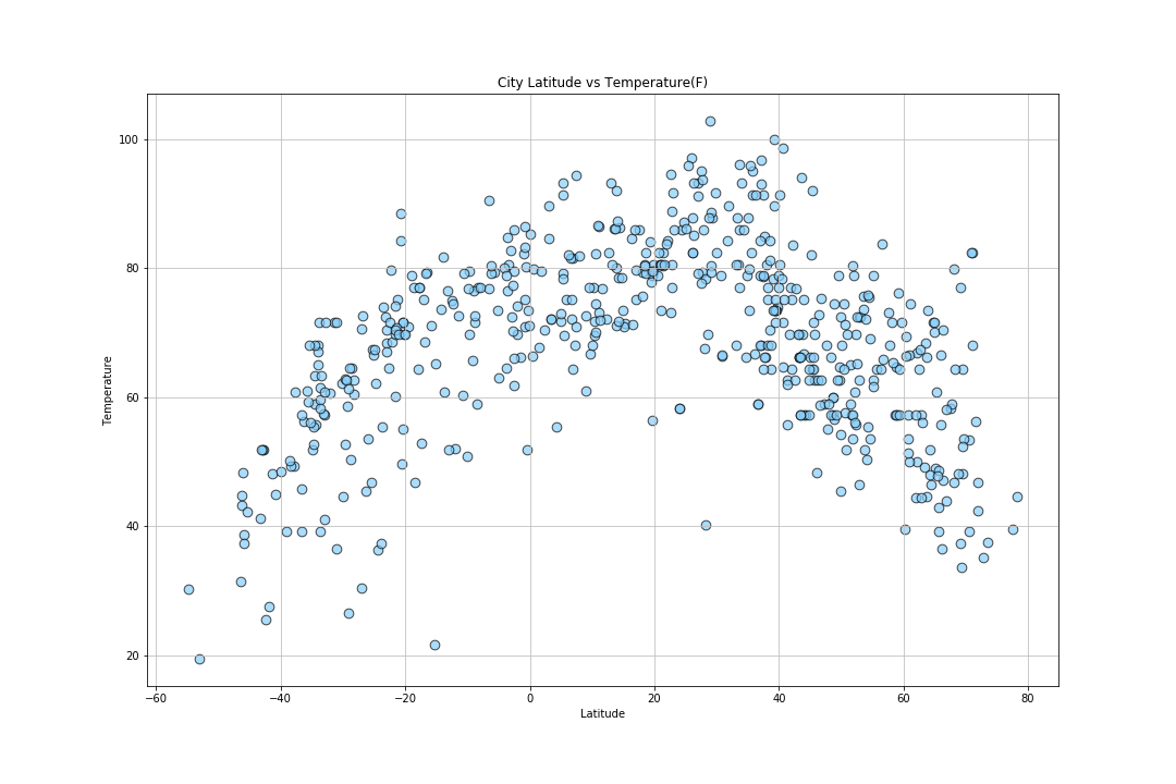
Though the data was compiled randomly, it was striking to see a preference for cities in the Northern Hemisphere. Latitude values ranged from -60 to 80 with what looked like 2/3 of the data points populating >0. In a way, the data visualized the landmass distibution of Earth itself: ~68% Northern Hemisphere, ~32% Southern Hemisphere. This indicates that we would see similar patterns when surveying Longitude data, as the landmass distribution is roughly the same East vs West.
Click on any plot to see an in depth analysis